As part of our 10 Year Anniversary spotlight, we’re speaking to just a few of the many authors and illustrators that have made their mark on Bonnier Books UK across our first decade.
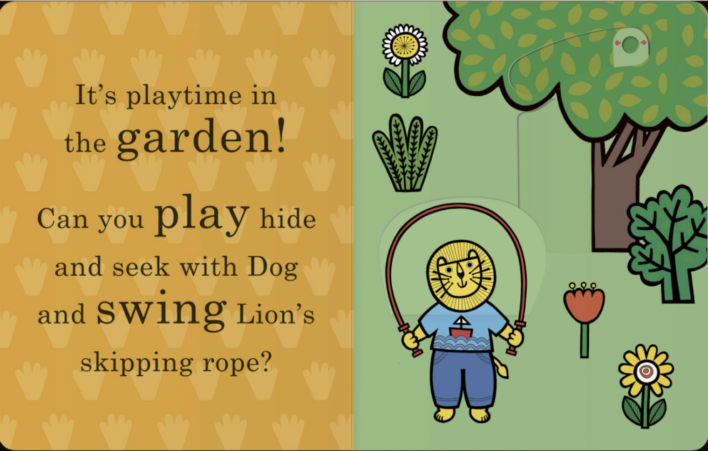
Here we chat with author-illustrator Jane Foster about the method and the imagination behind her extraordinary work. Appealing to adults and children alike, Jane’s bold, instantly-recognisable designs have become a staple of the Templar Books list, with over thirty hugely-popular titles published and 850k copies sold across the globe.

What inspires you as an illustrator?
I’m inspired by lots of things from vintage fabrics, Scandinavian ceramics and design, mid-century architecture and 60s children’s book illustrators.
Your books play a huge part in what is a very special time in people’s lives – they might be the very first stories parents read their children. What have been your favourite reader reactions?
I’m sometimes very fortunate to be sent little videos from mums reading to their children. One little boy couldn’t stop giggling whenever his mum made the noises in my book Things That Go. I still have that video and it makes me smile every time I watch it!
Do you have a personal favourite character? Panda from Baby’s First Stories is a firm favourite in our household!
I would agree – I’m also very fond of my Panda and know it’s my character that many children respond to well.

How does the collaboration process work when you’re working with an author like Lily Murray?
It’s a very smooth process – I’m shown the text and I then dream up suitable illustrations for each spread – my graphic designer also helps here too.
And can you talk us through your own illustrative process? Where do you do your best work? Are you a daily doodler?
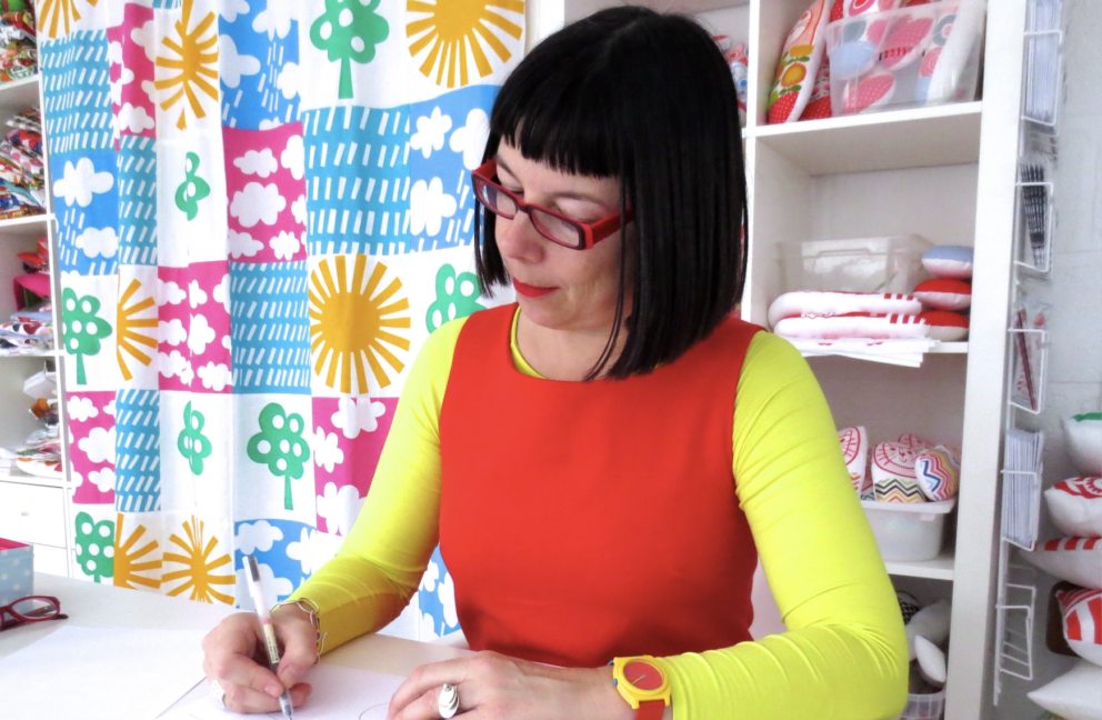
When I’m working on my children’s books, I always draw in a tiny little room downstairs in our house. It’s a room I’m lucky to have solely for illustration – it’s got a large table in it, all my drawing pens and several shelves full of children’s books that I collect. I always draw on smooth white paper with a fine line 0.38 Muji Pen. These pens create a smooth fine line and don’t smudge. I tend to draw on A3 size paper so when it’s scanned into the computer and reduced to fit a book page, the quality looks very clean and neat. I don’t enjoy rough sketches, I prefer instead to be quite precise and neat when I draw. I sometimes use a lightbox if I want to draw over one of my existing drawings to amend it slightly. If I’m really unsure of how an illustration will look, I’ll draw in a soft pencil first before going over with a pen. My fine line illustrations are then scanned into the computer at a high resolution before I add colour digitally.

How have your prior experiences as a teacher helped your craft?
Good question! I’m not entirely sure! I do know that I’ve had years of working with young children so this might help me to imagine what they’d like to see on a page. I also know that children appreciate bold design. I think having been a teacher has given me a good work ethic.
Is it true that you took your first steps in book illustration by creating one for your sister’s children just for fun? Do you have a message for any artist hoping to take their first steps in this exciting world?
Yes, this is true but it was literally years and years before I actually had a book published. I had no idea that I would (or could!) ever be a published illustrator! My tips would be to keep drawing and creating lots, sharing your work often and eventually, you’ll get to find your own unique style.
You’re in excellent company on the Templar list! Are there any other artists on the Templar list you particularly admire?
I love Sam Usher’s illustrations. They’re so tender and full of warmth. His style is very different to mine so perhaps this is why admire him so much. (*We both play the piano which is a fun coincidence!)


